Brick & Barn Real Estate Group
Where Your Next Chapter Begins
The Project
Real Estate Branding for Upper Valley Clients
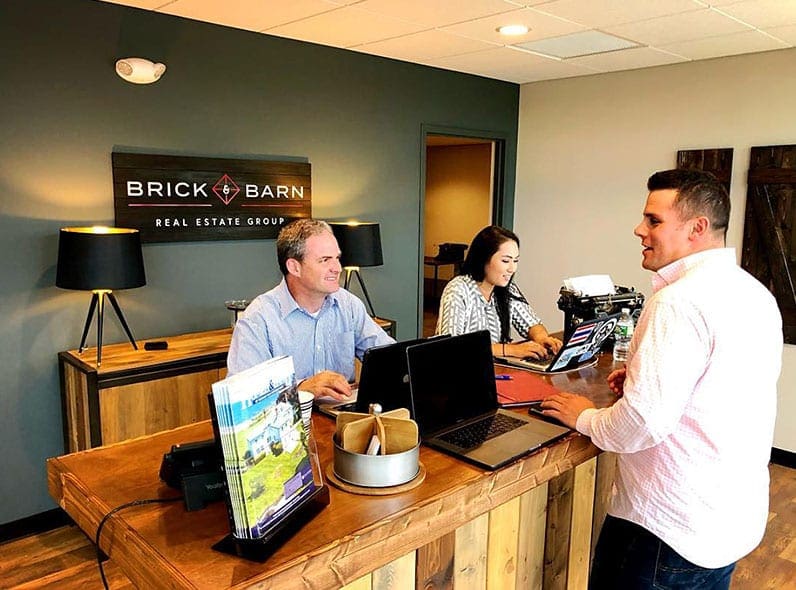
Brick & Barn Real Estate Group is a northern New England company that provides a concierge approach to buying and selling properties. Founded over 50 years ago as Quechee Lakes Real Estate Center in Vermont, the firm today has over six office locations and provides services including residential and commercial design, sub-contracting, project management, purchasing, décor and installation. With a pending purchase of a real estate brokerage business in Vermont to lay their physical footprint, the owner wanted to rebrand the firm.
Client / Brick & Barn Real Estate Group
Industry / Real Estate
Location / Portsmouth, NH
Visit / www.brickandbarngroup.com
Project Scope
Philosophy
Final Logo
The Need
A Rustic Home for Real Estate Clients Across the New Hampshire Seacoast
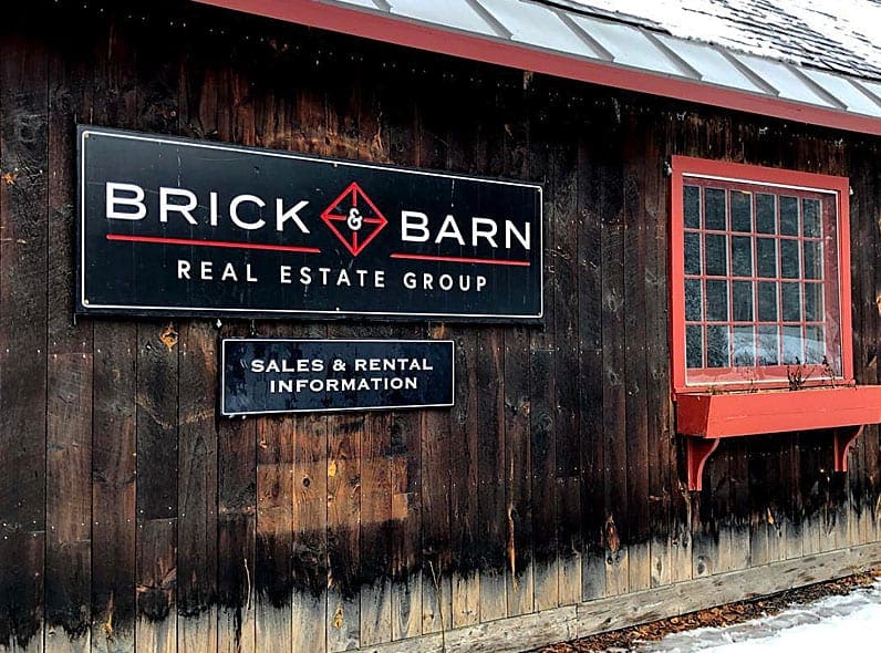
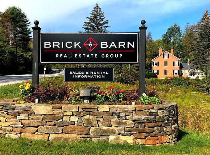
The owner was purchasing a brokerage firm housed in a rustic Vermont farmhouse built in 1850. The historical nature of the building would become an important element to the company’s office culture, creating spaces for their employees and clients that are collaborative and as homely as people would feel in their own homes. With the real estate rebranding, they wanted a name that speaks to their upscale services, the historical Vermont farmhouse property and could be relatable to clients across New Hampshire.
The Journey
A Brand Illustrated from Barn Doors to Commercial Buildings
The first task in the real estate branding was to determine a unique name, using their founding farmhouse as inspiration. The core elements of the farmhouse included a red barn and a brick foundation, exposing rustic, New England features. RYCO Design worked with the owner to brainstorm some names, eventually settling on Brick & Barn Real Estate Group as the real estate brand name.
After confirming, the team then focused on the visual design. Instead of going the conservative route of most real estate firms, RYCO Design proposed concepts that were out of the box. The team presented five concepts, all with a dark color palette, to represent a hip company with New England inspiration. These concepts all included a dark color palette, much different than the lighter, neutral logos of other real estate companies.
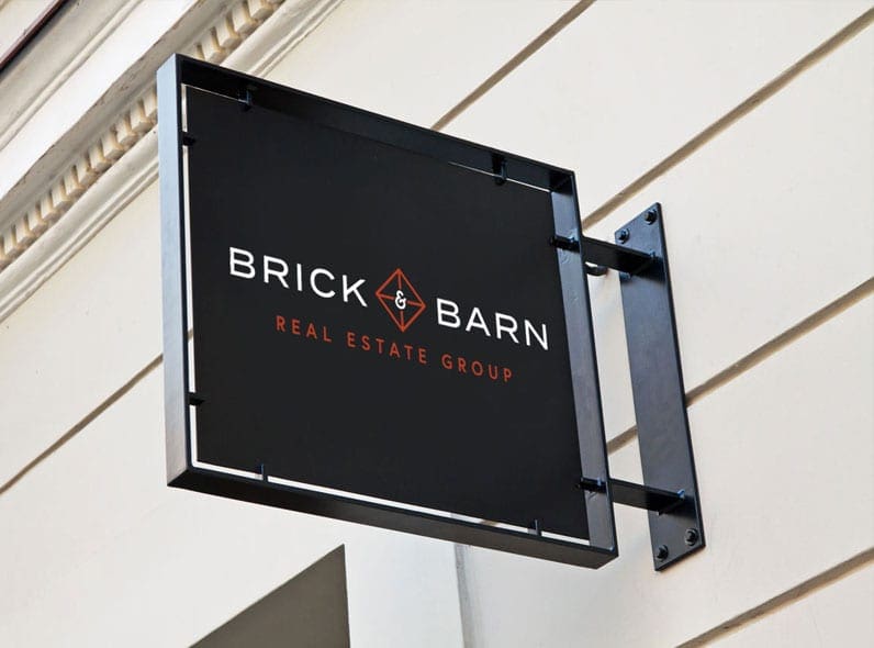
The primary concepts incorporated an icon with two elements; a barn door and the letters “BB”. The logo was a vintage look, completely unique from other firms. The colors were based on the deep reds found on the bricks on the property.
The Result
Sophisticated Rebranding and Design Execution for a Real Estate Group
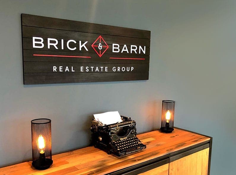
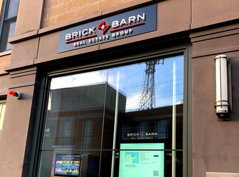
The company selected a final emblem that depicted barn doors, which provided a versatile, dual-purpose identifiable mark for Brick and Barn to use on any print or web application. The company name was flanked in a modern, sans serif font, with a hip color palette of black and red.
The brand speaks to the vintage foundation of the company and the sophisticated services offered by the brokerage firm. RYCO Design provided a full scope of rebranding, including selecting a company name, building a visual statement and designing all firm collateral to support the brand.
Since launching in Vermont, Brick and Barn Real Estate has had huge success and expanded their footprint into the New Hampshire seacoast, Maine and Massachusetts.
“We came to Ryan at RYCO Design for a complete rebranding of our real estate company. From the selection of a name, to the logo and look and feel of the brand, to digital and print ads, all the way down to designing letterhead and business cards, Ryan quarterbacked the entire process and build a company identity we are very proud of. His attention to detail, responsiveness, and patience with us made the undertaking not only extremely smooth but enjoyable. We still use RYCO on an ongoing basis for our company collateral, designing new ads and campaigns and other projects that need design execution. There isn’t a day that goes by where someone doesn’t comment on how perfect our brand represents our company and all of the credit goes to Ryan and RYCO Design!”